
Social media gets most of our attention.
But email is where the money is.
Since 2012 the average time people spend on social media has increased by more than 62.5%, taking up a significant portion of internet users’ behavior.
And while social media is used more now for top-of-funnel lead generation (paid ads over organic reach) social activity does not bring a direct increase in sales, with only a .71% conversion rate, which is well behind organic search at 16%.
“4.24% of visitors from email marketing buy something, compared to 2.49% of visitors from search engines and 0.59% from social media.”
According to the 2020 State of Handmade survey results, 59.3% sell online, with only 5.9% of expenses are spent on marketing.
You’ve heard me talk about how important your list is!
Email marketing is still the best way to engage your community, show ’em what you’ve got, and present special offers.
The big thing is getting people on your list.
Today’s tip is all about your form. (We’ll talk list building copy in another post.)
If people can’t find your form because it’s waaaay down in your website’s footer…
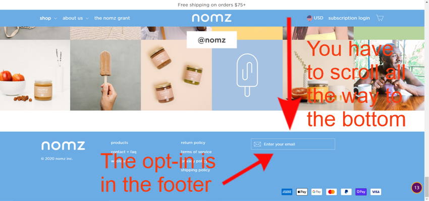
Or it’s a generic “Subscribe to the Newsletter”…
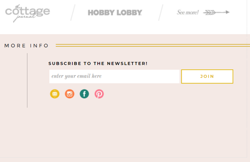
Sadly, you won’t get the subscribers you’re hoping for.
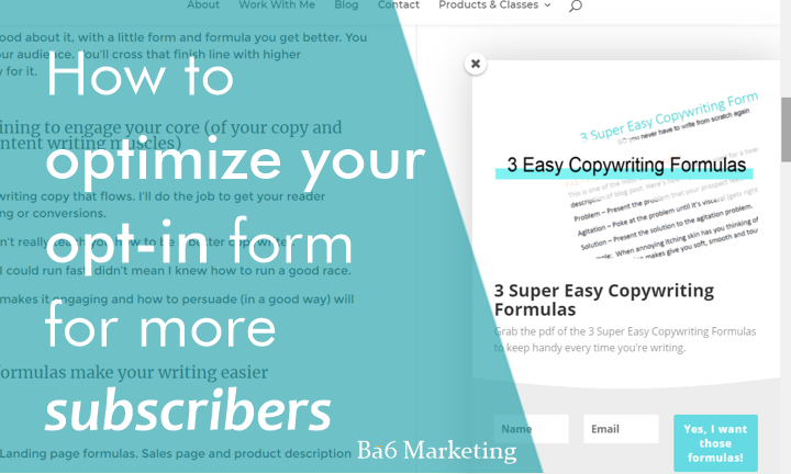
Bring your opt-in form front and center so people see it
Yes, that means a pop-up, a slide-in that presents, NOT when they first land on your website but trigger it to show up on the exit. That means…when your reader moves the cursor to the scroll bar or other up to another tab like they are ready to leave your page, your opt-in will get triggered and hopefully grab their attention so they stay long enough to give you their email.
You can also create a static form that appears on the top ⅓ tp ½ of your homepage. You can put it in the header or just below the hero section (the image you first see when you land on a homepage) where it’s visible all the time.
Get your subscription for up and out of the footer – no one scrolls to the bottom of the page. Do you?
I’m actually surprised that Sephora has their subscription form in the footer…and it’s generic.
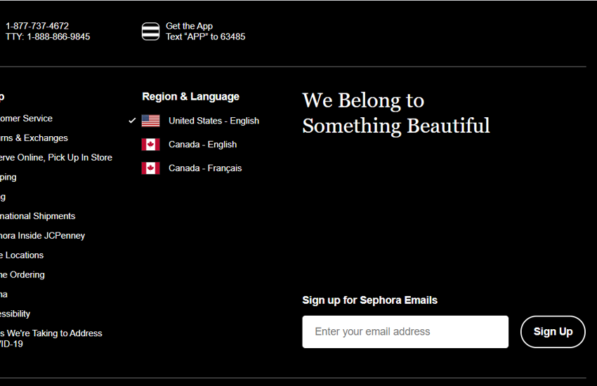
People don’t want to see another “Sign up for the newsletter” in their inbox (they probably aren’t reading the ones they have.)
They want something exciting and related to what they want.
Your opt-in form is the starting place for your customer’s buying journey. Make it memorable, interesting, and enticing.
Get your reader’s attention – start with an eye-catching visual.
Visuals are the first attention-grabber.
A good visual will stop your reader mid-scroll to see what’s going on and satisfy their FOMO.
Whether you hire a graphic designer or you’re a DIYer, make sure your opt-in graphic gets the attention of your reader.
You may be a DIY, which is great if you have design skills (I’m not one of those.) But if you don’t you can create great visuals using a platform like Canva, PicMonkey and others (here are a few more.) They often have pretty good templates to get you started.
If you have a great graphic designer, work together to come up with a design that stops your reader in their tracks.
This gets attention…
More than this…
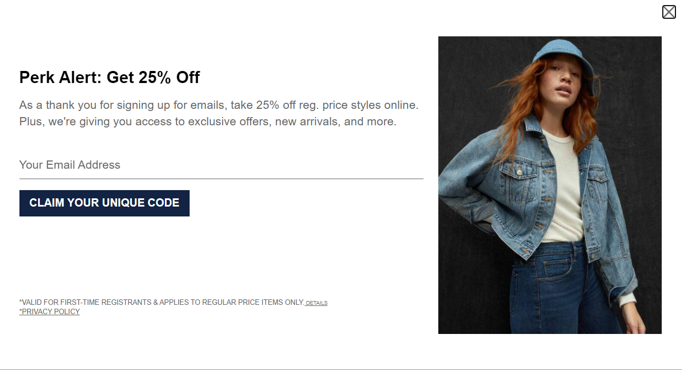
Are discounts persuasive? Not really.
When a 10% discount pop-up invades your screen time what do you do? Do you jump right on it or do you “x” it out because what you really want is to see the products.
I’m not one for the “10% discount of your first order” unless it’s in an abandoned cart series to entice a would-be customer to stay.
It teaches your customers to wait for discounts and sales instead of WOWing them with valuable benefits your product provides?
Discounts won’t solve your customer’s problem.
Unless you know without-a-doubt that the discount converts your reader, go for something that they NEED instead.
And by need…there is something they are searching for to solve an issue, challenge or” want” that they aren’t finding somewhere else.
Guaranteed your reader has a drawer full of product that didn’t quite work…but because they had a discount, they bought the product anyway only to have it land in the used-product-drawer-of-death.
Instead…
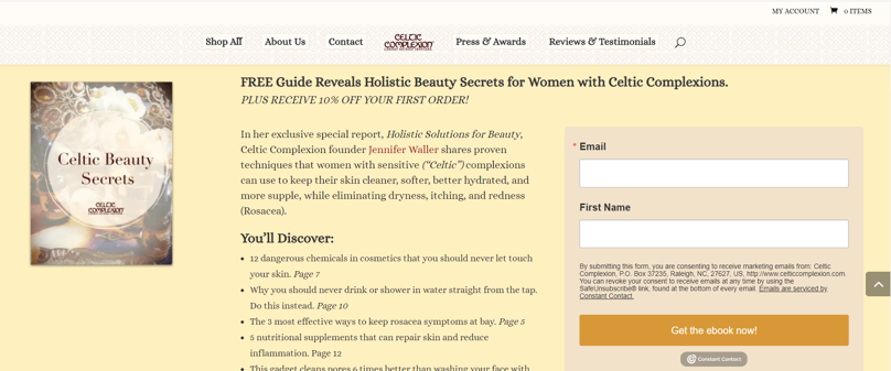
Lead with a persuasive, problem-solving freebie
Offer something of value that they can use right away. A guide, checklist, or answers to frequently asked questions about their current issue.
Let’s take Vosgue Chocolate.
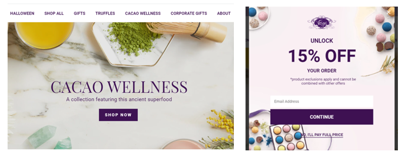
On their homepage they give me a teaser for something very interesting…
Cacao Wellnes – A collection featuring this ancient superfood.
Then they have their opt-in pop-up for 15% off your order.
What would you rather have?
For me…Cacao Wellness got my attention! I want to know more about how Cacao helps me feel better.
You mean chocolate is healthy for me!?
What makes it different than eating a Hershey bar? Damn…if I can eat chocolate AND have it be good for my health I want to know all the ways I can have cacao.
Lead with the free resource. It highlights your expertise and starts to build trust.
You can add the 15% discount in your nurture email sequence, just don’t lead with it.
Here are a couple more opt-in examples to give your audience…
- A guide to the most soothing bath fragrances.
- How about The 3 step soap-saver guide – what you need to know to keep your favorite soap from meting down the shower drain.
- How to wash your jeans so they don’t unravel, fray, or shink.
- You can watch more examples on my Youtube video Get More Newsletter Subscribers To Your List
See what I mean?
Giving your reader and potential new customers something that will help them start to solve the current issue or challenge they’re facing lets them see your expertise and gives them something actionable they can do right away.
And it means more to them than just another newsletter in their inbox.
Your copy is the brass ring of your opt-in
You have your attention-grabbing visual.
Next and equally important as your visual is your copy.
Your words matter!
Your copy needs to keep their attention, whet their interest, and keep them wanting to know more!
Just like with writing emails, blog content, articles, or product descriptions, your opt-in headline needs to be interesting enough that your reader wants to take the next step.
The “promise,” “benefit” and CTA copy is what gets your reader hooked and ready to take action (aka, subscribe to your list.)
Grabs their attention…and keep it…until they get what they need!
Another option…
You can make everything about your homepage and opt-in stand-out so that your reader can’t wait to subscribe to your list.
In all the websites I’ve reviewed and audited, I’ve never come across one quite like this!
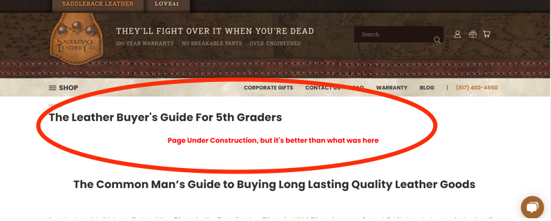
Saddleback Leather!
There isn’t anything on this page that would keep me from subscribing.
Even though there isn’t a pop-up or slide-in, and you have to go alllll the waaaay to the footer to subscribe…they’ve captured my attention with their copy!
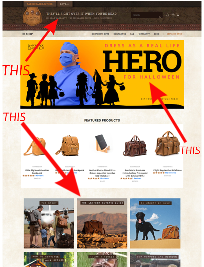
As you can see in the middle image block, they have The Leather Buyers Guide which takes you to another page (not an opt-in) that gives their reader ALL the info they will ever need to know about buyer good leather.
If you didn’t click the link above, go ahead to their website here…click The Leather Buyer’s Guide image and go to the page, you’ll see what I mean! (I’ll wait for you right here.)
As if I wasn’t already taken by their messaging when I got to The Leather Buyer’s Guide Page, that clinched it! Amiright? Just me?
Now more than ever you have to get creative when it comes to building your email list.
While social media is your place to wander, listen in on conversations and research to pinpoint your ideal customer, your email list is your golden ticket to more sales.
And the only way to build that list is to step up your opt-in.
So remember…
- Use a pop-up, slide-in, that is triggered on the exit.
- Or have a static opt-in on the top ⅓ – ½ of your homepage – and make it something they can’t refuse.
- Make your visual POP – it’s what your reader will notice first.
- Your copy matters! Write an attention-grabbing, scroll-stopping headline.
- Give your reader a resource or something juicy that starts to solve their problem (they have one that you can solve, you just have to uncover it.)
- Bring it out of the footer and in plain site! Either in a pop-up or in the top 1/3 of your home page.
- Change “Join My Newsletter” into something attention-grabbing that meets a need they have right now.
Last thing…
Don’t be afraid to test and change your opt-in. It may take a few tries to find what converts the most visitors to your list.
If you have questions or need to know more…drop it in the comments here or join me over in the CMO – Creative Marketing Online FB group and I’ll answer you…we’ll get your opt-in doing what it’s meant to do! 😉
(Oh and of course…this form below is where you can opt-in to my list and get the copywriting, content and marketing tips you need for your business.)