When you meet someone for the first time…

It takes just one-tenth of a second for us to judge someone and make a first impression.
In psychology, a first impression is the event when one person first encounters another person and forms a mental image of that person.
The first impressions individuals give to others could greatly influence how they are treated and viewed in many contexts of everyday life.
Not only are people quick to form first impressions, they are also fairly accurate when the person presents him or herself genuinely. People are generally not good at perceiving fake emotions or detecting lies.
What do I mean by first impressions?
The first impression someone has when they land on your website.
We all have one.
Now more than ever brands are updating their site and seeing more traffic in 2020 than in previous years because more people are buying online.
In August, online sales reached $63 billion, and the first eight months of 2020 generated $497 billion in online sales, according to Adobe. Since March, Adobe attributes the pandemic to an extra $107 billion spent online. As of August, 130 days in 2020 exceeded $2 billion in online sales, compared with 2019, when only two days exceeded $2 billion in online sales outside of the holiday season. (Source:DigitalCommerce360)
Maybe this has happened to you…someone is trying to sell you something and is REALLY good at persuasion…but not so good at delivering what’s promised.
You get your product (or service) and it doesn’t live up to your expectations.
Your first impression is now compromised. You doubt you will ever buy that product again.
THIS is in part why so many people searching for products have become skeptical.
We’ve all been there, we’ve all been burned.
And knowing you a product maker…this is the LAST thing you want to happen when people land on your page.
You don’t want to sound salesy.
You want to be genuine (not fake.)
And you want people to feel they will get exactly what you promise – or more!
SO how do you make sure that the first impression people get when they land on your website…is true…and reflects who you really are as a brand and a person?
It comes down to 3 things.
- You are NOT a corporation…so don’t sound or look like one!
- Show your brand personality…show your personality, your X Factor, your chutzpah, whatever you want to call it. You need to show that personality on your website.
- Look professional without sounding generic…too many other brands online use vague and meaningless copy. How can you stand out?
What do you see first – the image
Your reader sees your image first, so what does that image convey?
Image sliders/carousels
First no sliders/carousel on your hero section. Use one static image.
Less than 1% of readers that show up on your page will wait for that image to scan.
It can also be a trigger…if it’s scrolling too fast, and they can’t see what’s on the page, if it’s scrolling too slow, they get frustrated.
Stock images
Branded images are best but…if you’re going to do stock photos, try to get more artistic and creative ones that not everybody has.
You can use Canva or Photoshop to change those images slightly so it matches your brand. And make sure you use images that really represent your brand and what you stand for.
A HERO done right
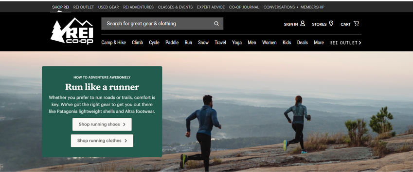
REI is an outdoor company.

Their hero section shows people doing outdoor activities from camping to hiking and biking. Whether this is a stock photo or not, it’s right on-brand. (We’ll talk about their value proposition in a minute.)
A Hero that needs a little work
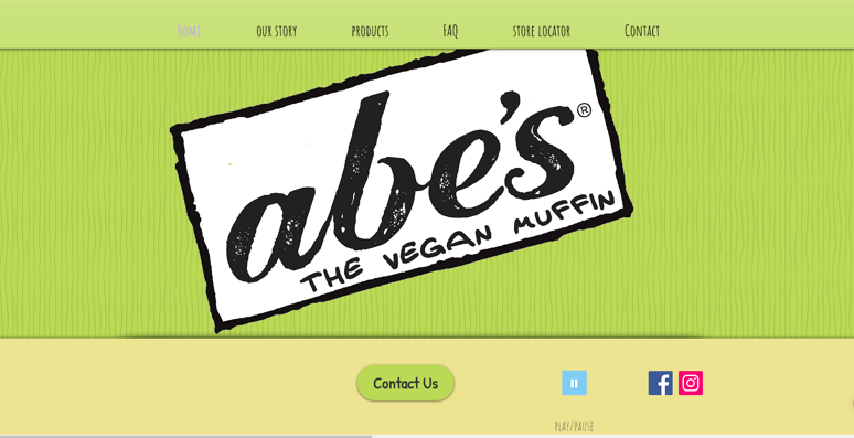
Now take a look at Abe’s Vegan Muffins.

We all know that vegan snacks can either taste “meh” or can taste surprisingly good! So how about telling me what I can expect.
Does it give you enough information to entice you to keep scrolling down the page?
A logo image is fine…if there’s enticing copy that grabs my attention and keeps me reading. More on the copy below. (And no endless loop of music.)
So how do you get good images if you don’t have an REI budget?
Youtube…there are SO MANY videos showing you how to take good product images. How to set up lighting. Even how to edit.
Ask other product makers…how did they learn or WHO have they used for photos.
Don’t discount your phone! Most phones now take amazing images!
Product image or lifestyle image?
One of the things we’ve tested is using a product image only or using an image of a person using your product (lifestyle image.) The results show people “using” your product converts higher than just a product image.
To figure out the best image for your site…ask your customers. Survey them….have 3 images for them to choose and let them pick. After all, they are the ones that will be influenced. (Remember…it’s not about YOU. wink)
We see all too often what happens when somebody lands on your site and they don’t feel like it’s for them. Bounced rates go up. Conversions go down.
Now for your copy
When people land on your homepage, and they just see an image, you’re leaving them guessing.
You’re leaving them wondering if they’re in the right place.
You’re leaving them guessing about what your product does and what they need to do next.
Your copy needs to show your reader that you understand their needs (you get this from VOC), shows the benefit your product offers them, and what promise or value your reader can expect.
Vague, generic or jargony messages don’t mean anything to your reader.
Without a message in your hero section it leaves people guessing about:
- Who your product is for?
- What does your product do?
- How can you help me?
- What do I do next?
This is where a good value prop makes a big difference
Your Value prop is not your tagline or a clever slogan.
Your value proposition needs to clearly communicate the value you offer.
 (Source: Meclabs )
Your value prop is “ what you offer + the benefit to your readers + the promise they can expect”
Use your VOC to help you write a value prop that makes your audience “see themselves” in your message…
…and has them thinking right off the bat that YOU GET THEM and THEY’RE IN THE RIGHT PLACE.
100% natural and organic
This doesn’t tell your reader a lot about your brand and what it will do for them?
Let’s go back to REI and their value proposition.
How to adventure awesomely
Run like a runner
Whether you prefer to run roads or trails. Comfort is key.
We’ve got the right gear to get you out there, like
Patagonia lightweight shells and ultra footwear.
Does this answer what they offer? The benefit to their reader? And what they can expect?
Now let’s improve on Abe’s.
Abe’s vegan muffins did not have a value proposition.
The hero section didn’t offer us a lot of info to help us (as the reader) feel we’re in the right place, understand what is offered, and what to expect from the brand.
Even a simple value prop like:
Abe’s vegan muffins and treats have the healthy ingredients you expect AND tastes great too.
This gives the reader a better understanding of what they offer, the benefit, and what to expect.
Your exercise
Review your website.
- Does your image match your brand?
- Do you have a value proposition that speaks to your reader?
If you aren’t sure, grab some of your biz besties and ask them to review it for you and give you honest feedback.
When someone lands on your site you only have a couple of seconds (3-5) to make that first impression.
The first impression that will get them to stay and read more of your page.
Make your first impression a lasting one.

