It’s time for a mini website copy review!
As with all mini reviews, I’m going through a website homepage and a product page.
In mini reviews I look for a couple of different things.
I’ll look at the hero section, the opt-in, and how they’re bringing customers through their customer journey on your homepage.
And of course, I’ll be looking at copy, as well looking at how or if they’re using VOC (voice-of-customer) data, in the copy.
A quick VOC review
What that means is…
…gathering data from reviews, from surveys, from interviews, Facebook groups for their product.
The reason we use VOC data in copy is to really get in the heads of our readers to discover what they want and desire, as well as understand their challenges and issues.
And the best way to do that is by looking at what they’re saying, you know, are they having issues or challenges?
Are they excited about something?
What are their desires, because the more that we use our readers words in our copy, the more it will connect, it won’t sound like we’re trying to make something up.
It won’t be clever. It won’t be cute. It’ll be direct.
Yes, you want personality in your copy as well.
Now…on to the review…
The Homepage – review of value proposition, opt-in, and customer journey
Body Systems Healthy + Active Apothecary
I’ve been working with Teri, of Body Systems Healthy + Active Apothecary, a bit here and there on her website.
My first impression when I land on the homepage…
I’m so psyched.
I’ve seen a few iterations over the past several month.
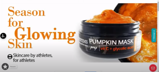
As soon as I land on the page, I see a great image of the pumpkin mask.
I’m looking at copy, but visual impressions matter when first landing on a website.
Does the image give me an idea of the product line? Is it a clear image? What else does the image tell me?
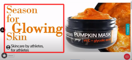
I know that this is a product for my skin…
Season for glowing skin
Skincare by athletes, for athletes
The section you see as soon as you land on a website is called the hero section.
When people land on your site…
Do they understand the reason they’re there?
Do they know what they’re looking for?
Do they know what products you have?
Is there some information in this section that tells the reader they’re in the right place?
If the reader has a pain, issue or problem, or if they’re looking for something specific, does the information in this section give them what they need in terms of the promise that you’re delivering?
Yes, a Season Full of Glowing Skin.
A value proposition, not a tagline, in the hero section tells your reader the promise and the benefit of your offer
I know exactly what I’m looking for…
…pumpkin mask tells me that it is for this season, glowing skin tells me what the promise is that the product will deliver going to deliver.
Skincare by athletes for athletes…I know who this is directed to.
The value proposition is about your business, what you offer and the promise that you can deliver to your audience.
Logos are part of your social proof
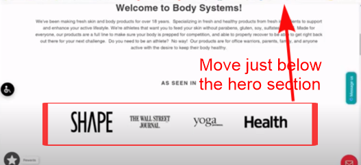
Scroll down just below the hero section.
This is where you add logos as some social proof.
As seen in: the Wall Street Journal, Yoga journal, it’s been in Health and in Shape magazines.
This is some pretty impressive social proof.
When the logos are right underneath the hero section, it shows skimmers social proof which starts to build trust, especially in recognized leaders in the industry.
Help your customer along the buyer’s journey
The section below the logos is a key part in the beginning of your customer’s journey.
When your customers land, or when would-be customers land on your page they need to know more about you before they even begin to think about buying product from you.
You need to HOOK them with a header that grabs their attention and gives them the right information they need to keep reading down your page.
Teri is looking at the customer’s journey, the buyers journey here, she’s also looking at the stages of awareness (link to video) that our customer may be landing here on.
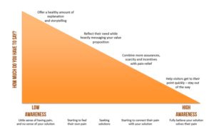
In a nutshell means your reader has a certain level of awareness, either of your product or of a pain issue and they’re looking for a solution.
Quick review – Stages of Awareness
Pain or Problem aware
If your reader is pain or problem aware, that means that they don’t know your product yet, but they know that they have an issue.
They may have searched on Google or Facebook, and are now coming to your page and need to know a little bit more about you.
When they’re coming in at that stage of awareness, they’re not ready to buy but they are ready to find out how you can support them.
Solution aware
If a reader is solution aware, they know there are other solutions out there, they’ve landed on your product as a solution so they can start looking at how you can help solve their problem.
Product aware
If the customer is product aware or a most aware person, they already know you. They know your product and either have bought or a ready to buy.
For a reader that is at this level of awareness…they may also be a skimmer or looking for a CTA to go right to a product.
In your hero section (if you template allows) like feature products or other product images on your page, you can place a button that links right to the pumpkin mass product page (or whatever product is highlighted.)
This section is nice and clean.
Copy Before…
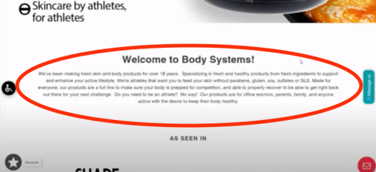
Welcome to body systems
We’ve made making fresh skin and body we’ve been making fresh skin and body care products for over 18 years, specializing in fresh and healthy products from fresh ingredients to support and enhance your active lifestyle. We’re athletes that want you to feel your skin without parabens, gluten, soy, sulfates, or SLS made for everyone. Our products are a full line to make sure your body is prepped for competition and able to properly recover, to be able to be able to get right back out there for your next challenge.Do you need to be an athlete no way our products are for office warriors, parents, family and everyone active with a desire to keep their body healthy.
“Office warriors”, I can bet, is from voice-of-customer data, and she knows that some of her people are office warriors.
This is what I mean by using your VOC in your copy.
…products are a full line to make your body prepped for competition…
…properly recover to get right back out there for your next challenge…
Using VOC help you understand your readers more deeply to move them from one stage of awareness to another.
Let’s turn on the editor…
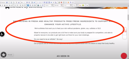
We want to make it so when people are skimming, they see the important pieces they need to read. So breaking your sentences up can make a difference.
So now as you read…
SPECIALIZING IN FRESH AND HEALTHY PRODUCTS FROM FRESH INGREDIENTS TO SUPPORT AND ENHANCE YOUR ACTIVE LIFESTYLE.
We’re athletes that want you to feed your skin without parabens, gluten, soy, sulfates or SLS.
Made for everyone, our products are a full line to make sure your body is prepped for competition, and able to properly recover to be able to get right back out there for your next challenge.
Do you need to be an athlete? No way!
Our products are for office warriors, parents, family, and anyone active with the desire to keep their body healthy.
If I’m skimming, this subhead…
…help specializing in fresh and healthy products from fresh ingredients to support and enhance your active lifestyle.
It stands out and hooks your reader.
Shortening long sentences and left-justify instead of ‘center’ for readability;
When you do that it’s easier to read and brings out important information your reader needs instead of burying those points in the middle of a paragraph.
Knowing your reader…
We’re athletes that want you to feed your skin without parabens.
This states to your reader that there’s no junk in.
Do you need to be an athlete? No way because you know what?
As the reader, I may be wondering, Well, okay, I’m not an athlete, but how can this work for me?
SO, with the statement…
“Our products are for office warriors, anybody that wants to keep their body healthy.”
It’s like you’re in your reader’s head…reading their thoughts and taking your reader through that customer journey.
Icons, explanations and headings
Images and icons like “prep, compete, recover, pamper” also tell a story along your customer’s journey.
They’re well done because it shows the steps in the process, as well as what the products are for.
![]()
Keep your skin in the game.
Great heading here.
We handmake skincare essentials fresh with healthy ingredients to support your active lifestyle. Don’t let irritated skin stop you from what you want to do.
We have a long statement here.
When we write copy in longer paragraphs, a lot of times with skimmers they won’t see that essential piece that may be buried right in the middle of that paragraph, even though it’s a short paragraph
Break up your paragraphs into one-sentence paragraphs.
![]()
This is not English class…it’s perfectly fine.
It helps the reader skim faster, grab that information and makes it more clear.
Now introduce your reader to your best sellers
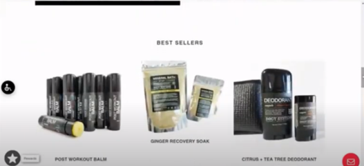
I’ve seen it in hundreds of different ecommerce sites. There’s not copy for the reader to engage with, it go right to the feature product.
What happens is your reader doesn’t know enough about your business to jump in and start looking for product.
Creating sections helps your reader understand your brand, and so they can self select their next steps…whether to read more information or to start looking at products.
Testimonials…raving reviews…showing the love
You can even change this word here testimonials on looking do something like raving reviews.
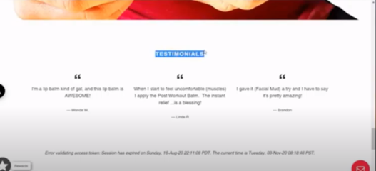
This is what copywriters call placeholder copy. This is a really good place to use your copy chops to create a headline that’s eyecatching for your reader and more on brand by showing your personality.
Call it raving reviews, showing the love, or any number of catchy phrases other than just testimonials.
Again, depends on your brand personality. Okay, cool.
To opt-in or to not opt-in
All the way down to the bottom of the page is the email subscribe.
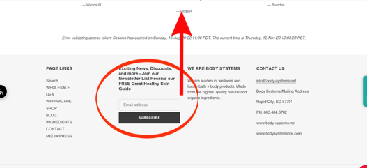
Bring that up to the top of the page. Make sure that you have a pop-up or a static form that your reader sees and can choose to subscribe to your list.
Now, two things I want to talk about with your opt-in…
Do not have it pop up as soon as someone lands on the page!
That can be very triggering for people.
We’re looking for higher conversions, not lower conversions.
Same for you chat box!
Do not have it pop up right at the beginning, because people aren’t ready for that yet.
Set your pop up to trigger on the scroll, at least halfway down to the page.
Better still is to have your pop-up trigger on the exit. That way your reader has time to read your page without feeling pressure to sign-up for you list before they’re ready.
It’s not quite as annoying and it’ll keep your reader on longer.
Make you opt-in valuable to your reader
Does your reader want other discount?
Probably not.
Having a pop up of a discount, showing up may not be enough to sway your customer.
People aren’t really looking for a discount.
I’ve talked brands that say their clients don’t want the discount, they want to pay full price.
This is part of understanding your ideal client and offering a valuable piece of information that helps them find the product that’s best for their needs.
You’ve done your voc research and know more about your clients and what they’re looking for.
Create a valuable piece of information
It could be a guide, a checklist, something that engages your reader and answers their most pressing questions, pain points or issues.
It could be a guide that helps your reader take care of their competitive skin. (Since this brand has an athlete focus.)
Let’s go to a body care product
Post Workout Balm
There’s a short description and the longer description.
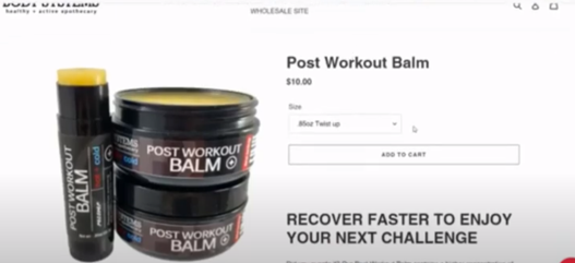
Instead of the standard product template, create your product pages as a landing page because you’re still taking your reader through that customer journey and the stages of awareness that may help them understand what each product is.
Yes, this is a longer process and it’s more copy than you’re used to writing.
But, if you want to increase your conversions, this is super important.
Write product names so they’re recognizable to your customers.
If your ecommerce template allows you to, add a subhead with one or two search terms or keywords because the search engines crawl titles, headlines and subheads.
It could be an ingredient or a term you could add as a subhead.
It may depend on your platform. Not all platforms allow you to do that.
Recover faster to enjoy your next challenge.
Awesome subhead.
The longer description…
Did you overdo it?
Use a copywriting formula to help you write your product descriptions.
Teri is definitely using a copywriting formula here. In her first paragraph, she is trying to connect with her reader by saying” hey, you know, did you overdo it?”
Our post workout balm contains a higher concentration of active ingredients with little fillers to make sure you receive the most benefit to those areas that need it most. Our unique topical remedy is formulated to provide powerful long lasting warming sensation and cooling effect. Helping also with the body’s own processes. A unique combination of select ingredients for fragrance, non greasy alternative to conventional chemical filled rubs.
Nicely done on your product description.
They don’t have to be super long, depending on how you’re talking to your audience and their stage of awareness.
She’s done a really good job here pulling her reader through this.
This is a big deal…
Notice anything that Teri’s has done?
She has been very, very careful in writing claims.
There are no claims that are really going to have to get her flagged by the FDA.
She doesn’t say healing.
The only word I’m a little curious about is the word “topical remedy”. That may need to change.
Look at… it’s a long-lasting warming sensation, cooling effect helping with the body’s own processes.
Nowhere in she making a medical or a health claim.
It’s very nicely done.
The Mini Web Copy (and claims) Review Summary
We went over the homepage, the hero section, the image and the value proposition.
We went down the whole page to make sure that the copy is speaking to the customer on their journey.
Leading the reader through those stages of awareness, as well as reviewing the opt in…and how important it is to have that show up on the exit and not on the as soon as somebody gets on the page, because that is a trigger.
We’re looking to increase conversions.
Whether that conversion is to get more subscribers on your list, or bring people to a sale.
On her product page. We did basically the same thing. We looked at the short description and the long description.
Did that lead the reader to a stage of awareness where they see that the product for them?
Does it feel right for them?
Do they see themselves as an ideal customer and what they can expect from the product?
Teri did use VOC to connect with the customer.
Each product description will be different.
You want your brand to stand out and be uniquely you. Customize it for you for your customer to really make your brand stand out.

